The purpose of this blog is to outline, and provide resources for, the work we'll do in May, June, July. I've changed this from last year, as we'll be working on Music Video in June/July, but the archive posts are still useful!

Monday 10 May 2010

Lessons from May 11th-14th

After you return from study leave we'll be focussing on Music Videos - thus the blond wig...
Before then, however, I'd like you to reflect on your year in Media as well as begin to explore the use of Photoshop.
Tasks for the week then will include:
  1. designing a poster for your film (I'll see how many have used Photoshop before and do a lesson on this if it seems necessary)
  2. Co-Op Film Fest entries!
  3. video intros for your film
  4. video snapshots of what you've learned/demonstrations of what you've learned/how your view of the media - or how you 'consume' it - has changed
  5. if there's time, video questions for a quiz I can use with next year's AS!

Friday 25 September 2009

New A2 Media blog address

Throughout the year, in addition to some materials on the VLE, I'll add some material on the A2 at: http://a2media0910.blogspot.com/ - starting with details of what to include on your new blog, and an overview of the stages in your A2 coursework production

Sunday 28 June 2009

FROM FINISH TO START

Lest anyone find themselves as finished as Aki Kaurismaki and awaiting all and sundry to emulate your blissful state of pre-exhibition completion, you could start thinking about ideas for the following filmic concepts (or be considering means of bringing video-recorded-but-health-and-safety-minded harm to fruit/veg for the planned music vid):


  • OI! DENSE OR WHAT?! - take any example/aspect of audience theory (you watched the ad with the gorilla drumming; according to the hypodermic syringe model you rushed straight out and bought a gorilla suit/Phil Collins' Greatest Hits CD, right?) and illustrate it in any way you see fit. Fortunately, as an active audience member, I was completely unaffected by the potent ideological messages encoded in the cult classic Leningrad Cowboys Go America, viewing it simply for my own uses and gratifications. You can try this exercise, or look at some overviews (mediaknowall, mediaed, northallertoncoll), or download this fairly comprehensive overview.
  • THIS IS YORKSHIRE - ee by gum...could be a short documentary, a series of vox pops (asking for views/definitions of Yorkshire or some aspect of it), a tribute to Last of the Summer Wine (about to be resurrected once again, yay!), a quest for Amos Brailey's whiskers, a drama centred on aspects of the stereotype (a parsimonious superhero with magical flatcap?), a recorded walk and talk along any of the many picturesque routes hereabouts, an historical re-enactment, Richard Curtisland re-imagined as Yorkshire...

  • MEDI(AN)ATION - the world has rarely seen a happier, smilier bunch than the Media Studies cohort, and I just know some of you would like to reflect on what the subject is all about, what you've learned, what weird and wonderful things have been produced by yourselves and others (and what's about to be produced; like the AC/DC album, you could do the proverbial Fly on the Wall doc), what's surprised you, where it's going to take you, how it's changed the way you look at things, what you'd like to learn more about, and/or riff on some aspect of Media that you're particularly influenced by/a fan of
You will have under 3 weeks to ponder, plan, produce and exhibit this latest masterpiece; guerrilla film-making at its finest...

Tuesday 23 June 2009

BEING ORIGINAL IN A PO-MO WORLD

Interesting article here by famed screenwriter Paul Schrader, reflecting on the idea that all ideas have been seen and done by now - and that we're even getting bored as an audience with narrative itself, thus turning to supposedly narrative-free 'real-life', naturalistic formats like reality TV and documentary.

PRINT SCREEN FOR MACS (USE FOR POSTERS/DVD SLEEVE)

You'll be wanting screen grabs from your film production for your poster/s and (especially) DVD sleeve (which will generally feature a range of stills from the film - some of which you may want to create as new...).
This web-page (here as a Word doc) shows you how.

Friday 19 June 2009

POSTERS, DVD/CD SLEEVES - & THE CHANCE TO GO OLD SCHOOL WITH VHS...


Having honed your Photoshop skills with practice on the RDogs posters, and any other additional doctored posters you may have tweaked to star in, its time now to give your own film the poster treatment, perhaps taking inspiration from the legendary poster pictured above. Ahem.
You can tackle this two ways: a set of 'teaser' posters or a main promotional poster. Teaser posters are centred on the concept of narrative enigma: they aim to arouse interest in a film in the weeks or months before release without giving too much away. Often this might mean a single image - featuring one of the stars - plus one or more of: a tagline/quote from the movie/release date/website URL.


A main poster will typically feature some combination of: image/s from the film; a 'billing block' (the very small-print details of cast/crew you always see on a DVD cover); star/director/producer (according to who has highest profile, eg producer Michael Bay often takes billing above stars in his action movies) names; title; tagline (a clever, short phrase/sentence); reviews; company and technical logos...
I've compiled two guides to this - a simple visual guide to measurements and a more detailed breakdown of what to include in posters, sleeves etc. There's also an article on the art of posters (and you'll have seen many books of film poster art for about a fiver in bookshops I'm sure) - click here to see all 3 docs.

Thursday 18 June 2009

INTRO TO PHOTOSHOP EXERCISE - LET'S GO TO WORK...

It seems most of you are familiar with Photoshop, so this should be a very brief exercise...
For those of you who are less familiar with this, just shout out anytime this is going too fast.

STEP 1: OPEN THE PROGRAMME!
Look for the lovely yellow flower:

If you don't see the icon on the toolbar along the bottom of the screen, go through Finder/Applications and look for Adobe Photoshop Elements 2.0.

STEP 2: SETTINGS FOR NEW DOCUMENT
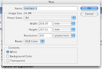
Congrats for getting this far! Click on 'new file' (and hit cancel if asked to register the programme; OK for any other error message). From the options you can see below you'll typically want to select A4 from Preset Sizes; 300 dpi for Resolution (if for printing off; 72 dpi if for web only); transparent from Contents, and RGB from Mode. DON'T CLICK OK AT THIS STAGE!!!!
Try changing the Resolution to 72 dpi - what difference does this make?
.............................................................................................................................
Now, switch the settings for Height & Width (to make this a landscape doc instead of portrait): so make Width 297.01mm and Height 209.97mm.
Wunderbahr. Now, give the new doc a name: RDogsYourName.
NOW click OK...


STEP 3: SAVING UP

Before we go any further - save it. Image editing programmes can eb quite processor-intensive and so sometimes crash... Be in the habit of regularly saving your work, just in case. Save this into your folder on the Lacie drive.

STEP 4: OPEN & FREE TRANSFORM A R DOGS PIC
Save the image at http://imagecache5.art.com/p/LRG/8/893/9FTJ000Z/reservoir-dogs--lets-go-to-work.jpg
Click FILE - OPEN to open this image file.
You'll now see a small version of this on top of your A4 document. We need to first of all bring this into our A4 document then enlarge it:
Check that the move tool is highlighted on the toolbar (top left of the screen - see pic below). Click within the RDogs image, hold the mouse button, drag into the empty part of the A4 document ... and let go.
The image now appears much smaller - Photoshop shows it how it is: a low-resolu
tion image can be expanded and still look good for web viewing, but if you came to print it this wouldn't be the case. We need to Free Transform the image: stretch it out without losing image quality.
Click in the small RDogs pic within your A4 doc. Drag it up to the top-left corner of the frame, as below.
Now click IMAGE - TRANSFORM - FREE TRANSFORM ... or just the apple key and T. Drag the image from the bottom right until it fills almost all of your A4 doc, let go and hit return.

STEP 5: NOW FIX IT!
For anyone not too familiar with the software, its highly likely you ended up with some grotesquely stretched/squeezed RDogs... Hold in the apple key and press Z. This undoes anything you've just done (apple+Y re-does your last step/s).
Now repeat the process but this time hold in the shift key until AFTER you let go of the mouse, then hit return. Everything should now be in proportion.
Holding in Shift ensures that the original proportions are maintained no matter how wobbly you are with the mouse!

STEP 6: STRIKE A POSE
You're going to transpose pics of yourself and other willing volunteers onto this classic image (and can then go on to do the same for any film poster of your choice), so will need to take a few snaps to use, and then upload these to your folder on the Lacie. Just before you do, I'll show you
how you can cut your visage out from the background of the photo to move into your RDogs doc.
Save the image at http://i781.photobucket.com/albums/yy93/DBigs/Dracoola.jpg and open it up through Photoshop. I'll quickly run you through the main options - The Magic Wand, Lasso and Rubber tools - for removing Christopher Lee's head from the backdrop, then you can have a go with this, and then your pics of yourself and each other.
You can always use this guide (with accompanying images) if you want to go back over this later. There is a nice guide here, which you can download as a single pdf file. (You can find plenty more by googling 'photoshop elements 2.0 tutorials')

STEP 7: HOW TO GET A HEAD IN THE FILM BIZ
Thats been a swift run-through (if my psychic ability has worked), but lets see if you can now produce something as all round wonderful and glamorous as the example you're about to see (and which I'm definitely not uploading!)...
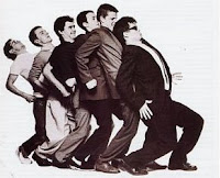


ONE STEP BEYOND
I'd like y
ou to apply your Photoshop skills to a series of productions:
  1. a personalized RDogs poster
  2. personalize any other poster of your choice - you can use the same cropped head-shots you used for 1
  3. poster/s for your coursework film (as with Lucy/Lauren/Kristie's effort which I'll now hold up...)
  4. a sleeve for your new Collector's Edition DVD, listing all the splendid extras it features
  5. a jewel box sleeve/cover for the OST CD of your coursework film, where you've thjought out which additional tracks would have featured in the remaining 88+ mins of your film (don't everybody use Napalm Death* though!)
I'll blog further details on the CD/DVD later.
* I see N.Death remain a by-word for weirdness: check out the name-check in the 2nd + 3rd last paragraphs of this June 2009 review!